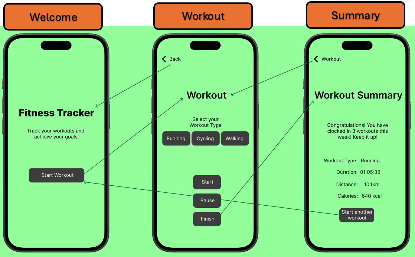
Wireframe diagram of the User interface of each view
The “Welcome” view serves as the app’s entry point, introducing the user to the app’s purpose and encouraging them to start a workout. It is designed to be visually appealing and engaging, capturing the user’s attention while minimizing the need for excessive user actions. For most users, that first glance is enough to orient them, which fits well with usability guidance about keeping choices minimal (Nielsen, 1994). The view presents a prominent title, a concise description of the app's benefits, and a clearly labeled "Start Workout" button. The visual design incorporates a background gradient and styled text to enhance the user experience. The “Welcome” view initiates the workout process.
Tapping the "Start Workout" button triggers navigation to the “Workout” view, transitioning the user from the app's introduction to the active tracking phase, where users select a workout type (Running, Cycling, Walking) and control the session with “Start”, “Pause”, and “Finish” buttons. The controls are laid out logically and map directly to common workout tasks, which makes the flow feel natural. Users choose a workout type, then tap to begin the workout, tap to pause if needed, and then tap to finish once they have completed it. It is a simple loop that reduces distractions during exercise and aligns with Norman’s principles of clear affordances and immediate feedback (Norman, 2013).
After finishing and completing the workout, the user is directed to the ”Summary” view, which provides a concise overview of the completed workout, while reinforcing the user's accomplishment and motivating them for future sessions, such as “Congratulations! You have clocked in 3 workouts this week!”. That positive reinforcement is a small but effective motivational nudge, and persuasive design research shows that gentle encouragement helps sustain behaviour over time (Fogg, 2009). The “Start Another Workout” and Back buttons at the top left corner make it easy for users to repeat the cycle, keeping the app’s primary goal of logging in workouts effortlessly.
In conclusion, the fitness tracker app achieves a useful balance, is easy for new users, while having enough functions for repeat users. The linear and focused design keeps the user’s attention on exercising rather than navigating between different buttons and menus.
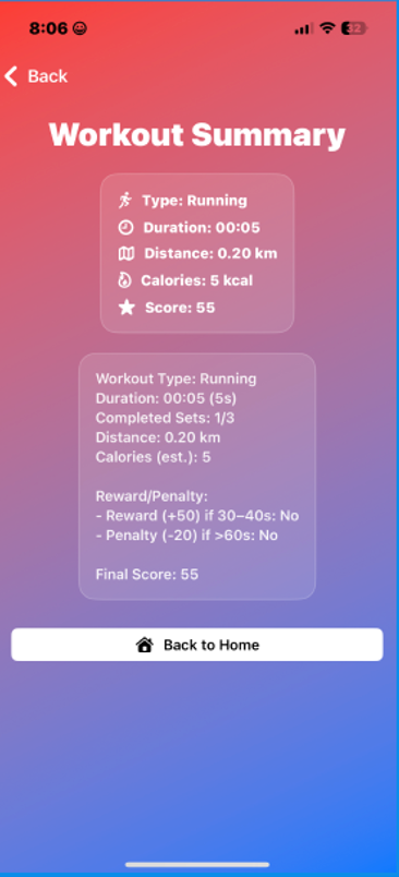
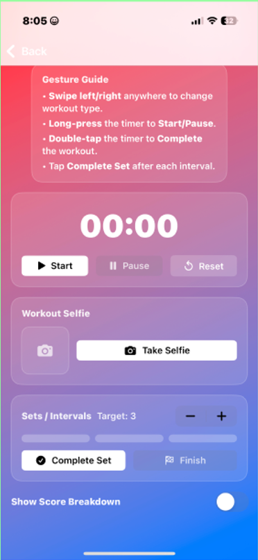
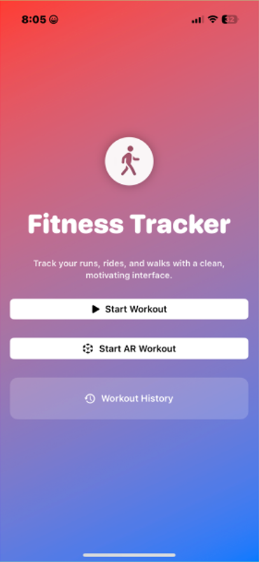
There are multiple codes throughout the files that make the Fitness Tracker app visually appealing through the consistent use of buttons, sections and icons that help make it easy for the user to navigate. All these texts are in white and black, which helps them stand out easily against the app’s red and blue gradient background. Some of the app’s screenshots are shown in the image below:
Reflections & Areas of Improvement
Developing the Fitness Tracker app was for sure a great learning experience as it was the first time developing an app through SwiftUI programming language. A few things that worked well were the implementation of gesture-driven controls, such as swipe, long press, and double tap, which created an intuitive and responsive interface while reducing reliance on buttons. Additionally, the inclusion of an AR workout challenge through ARKit introduces an engaging, gamified element that differentiates the app from other conventional fitness trackers. Lastly, the additional features, such as real-time audio feedback using AVFoundation and the ability to capture workout selfies with the camera, contributed to a more motivating and personalised user experience.
However, there remain areas for improvement. Firstly, the progress tracking logic could be expanded to include more detailed analytics, such as pace or heart rate integration if supported by external sensors. Secondly, the AR workout activity, although functional, would benefit from clearer onboarding instructions and a greater variety of targets to sustain user interest. Overall, the app successfully achieved its core objectives while leaving opportunities for future development.