
Lingscars.com Website Redesign
I will be redesigning Lingscars.com so that users will be have a better experience looking for the car that they wish to loan.
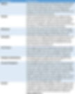
Sector Automotive Industry
Challenge The company's website needs to be redesigned to better connect with its audiences, including building a more intuitive information architecture and developing a coherent visual language.
My Role Information Architecture, Branding, Prototyping, Wireframing
Project Time 2 weeks
01 - Background on Lingscars.com
The main purpose of the website is to allow users to rent cars. The intended target audience is the general population of UK residents, eligible to drive a vehicle. However due to the high amounts of flashing lights, entertaining factors of this website, and its focus on leasing cars that are affordable, it can be assumed that the main specific target is aimed for the younger generation which includes recent graduates, first-jobbers, as well as newlyweds.

The look of the current Lingscars.com website
02 - Applying the Eight Principles of Information Architecture proposed by Mr Dan Brown to identify Design Issues
03 - Applying the Principles of Interaction Design (IXD)

The page is so busy that users do not know where to look and it makes the website very difficult to read. The website also uses too many fonts, as well as bold, italicized, flashing and all-caps text. The fonts clearly don’t mix well together and they make the website look even more cluttered. And lastly, while it is not one of the sins, I would like to state for the record that I think the colour scheme is horrendous.
User Research on a sample group of different types of users must be done to get a better understanding on any areas of improvement to ensure a seamless user experience throughout the site regardless of who is using it.
04 - Proposed Sitemap & Wireframes

The purpose of redesigning the following pages of the LingsCars website is to enhance its Information Architecture and Interaction Design so that users will not feel too overwhelmed with information and get their tasks done quickly, and in an efficient manner. To do this, I have eliminated the pages that were not meaningful to the average user. Some pages were renamed too so that users can achieve their tasks quickly, without any confusion or unhappiness.
Wireframes of the redesign were created using Axure RP 8 software and the pages are as shown below.
The Header and footer will be the same for all pages for the website for the purpose of consistency and ease of navigation for the users. The navigation in the header will feature common links that users will most likely use that is “LEASE” to see the list of vehicles available, “HELP” for users to see the process and all the information needed for leasing vehicles in LingsCars, “CUSTOMERS” to see the reviews and recent orders and “ABOUT US” for all information on the company.
The main content of the homepage is split into 4 different parts, and placed in order vertically so that everything is presented in a systematic order. The parts include a quick link to the car catalogue, link to view cars by specific categories, the four steps to leasing cars and also the coverage users will benefit from leasing with us.


The redesigned prototype gives users the ability to filter the cars by a number of categories such as “PRICE” “BRAND” and “POPULARITY” just to name a few.
The cars will be represented by their image, name and price. This is done so that users do not feel overwhelmed with so much information like in the current LingsCars page, and can proceed further with more information on the cars by selecting on the car.
Here, users are able to see more information available on the car and also see reviews of the car by other users. Users are able to see the description, features, reviews and accessories available of the car by clicking on the tabs towards the bottom half of the page.
In case if the user likes the car still has some more question about the car, the user is able to schedule a viewing appointment, or place an order if the user has already made a decision.


In here the user is expected to see enter their personal particulars before being able to view the car. As soon as the user clicks on submit, the user will receive an email of their response and a confirmation of their appointment for the viewing of the car they had chosen.
The user is also able to clear the form in case the user has keyed in their particulars or chosen the car wrongly.
05 - Prototype
The Online URL Link (Interactive) of the prototype created is given below:

Homepage prototype

Catalogue prototype

View car prototype

Schedule viewing prototype
06 - Usability Testing
Three users were given the prototype of newly designed website to perform 3 tasks, and the results were recorded and analyzed.

Picture of a usability test between me and one of the users
07 - Recommendations
Based on the usability test results and feedback given by the participants, a few changes had to be made. One feedback that was noted in the test was giving the user the option to auto-fill the personal details through google account, but cannot be done as the prototype did not have the ability to do that built-in integration.
-
The clear form button at the end of the schedule viewing page was mis-clicked by two different participants as it was too big and placed beside the submit form button. To improve this, I replaced the clear form button to be a link instead and placed below the terms and conditions box.

Figure: Prototype screenshot of before the adjustments.

Figure: Prototype screenshot of afterthe adjustments.
2. The participants had to reset the filters when making a change in selecting the car and to improve this, I had to reset the filter to mimic the last action done by the user.

Figure: The filter table in the “Car Catalogue” page
08 - Conclusion
Through this project, I learned that feedback is very important towards the user. Whenever there are actions done by the user, there has to be a reaction from the website. For example when clicking on a link, the colour of the link must either change or be underlined, so as to signify that there will be a change to what the user will see upon clicking. The way we present information has to also be very precise and flow in a way that users are able to understand and perform the actions needed for them to achieve their goal, without any worry or questions.