The Created Poster
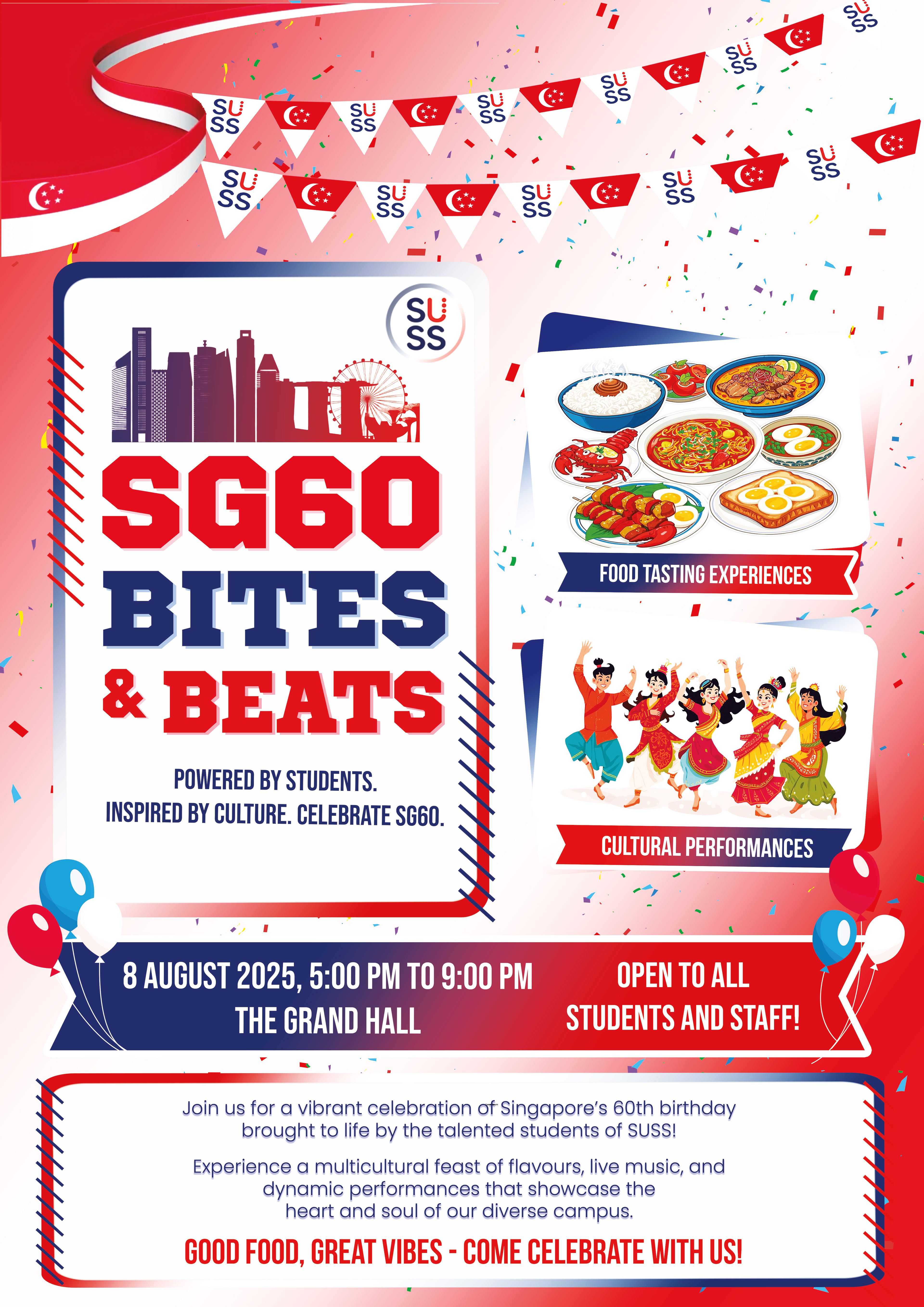
To help viewers of the poster quickly see the most important information, I applied size, colour, placement, and contrast visual cues to establish a clear visual hierarchy of my poster. The phrasing of the event title “SG60 Bites and Beats” and the visuals for the “Food tasting experiences” and “Cultural Performances” were the two components in the poster that I positioned as the most prominent among them.
The event title of the event got the greatest attention. A very big emphasis has also been given to it by way of size, contrasts, and location. The event title has been purposefully chosen as it is the main name of the event. Viewers will notice this message quickly as it will have a big text size, which will ensure visibility from a distance. The contrast of the red and navy over a lighter gradient background makes it pop. The positioning in the upper third of the design ensures that the title is the first thing the viewer sees, since they will start scanning the poster from the top. The function and message of the title capture the spirit of Singapore’s 60th birthday celebration, which is dominant. The poster centers the entire composition around the event’s identity, making it the most prominent element to help the audience remember it. This approach aligns with design principles that emphasise scale, contrast, and placement as the most effective tools for establishing hierarchy in visual communication (Ambrose & Harris, 2015).
The “Food tasting experiences” and “Cultural Performances” imageries are the second most dominant elements located on the right side of the title. The use of vibrant colours and lively illustrations of food and people immediately attract the viewer’s eye right after reading the event title. These images communicate what the event is about, through multiculturalism, and togetherness. The images also provide a sense of balance to the layout, especially when complementing the event title to its left, creating an engaging left-to-right reading flow. The strong colour contrast between the images and the gradient background ensures that these visuals remain eye-catching yet harmonious with the colour palette. By emphasizing this section as prominent, it helps to explain the overall theme of the event, and to encourage the students and staff to associate the event with enjoyment and community spirit.
The supporting visuals and secondary elements were intentionally kept less dominant to not take away from these two things. Decorative elements such as confetti and balloons enhance the celebratory tone and multicultural message. However, the scaling and placement of these images are such that they frame rather than distract from the message. The gradient background further strengthens this hierarchy by functioning as a delicate field. It ensures that key information stands out through contrast while decorative details remain vibrant in the background.
The layout is purposefully arranged so that viewers focus first on the event title, followed by the imagery and festive decorative elements, before finally settling on the bottom layout with the event details. This order is an achievable balance between aesthetics and communication. It makes the poster effective not just as a visual display, but also as a promotional tool.
The Animated Video